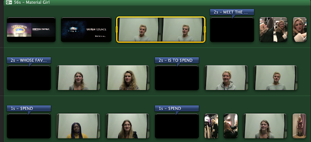
Editing Process
This lesson I worked on editing the font in my documentary trailer. I thought it would work well to use the dollar sign ($) for the first letter of the word 'spend', as it adds a bit of colour to the text as well as being a play on words. I was contemplating between the colours green and gold for the dollar sign, but decided on gold, as gold connotes the expensive metal gold. By simply using the word 'spend' in large font filling up the whole screen, it catches the audience's attention, as well as telling them exactly what the documentary is about: spending.
I also worked on editing the colours of the clips and increased the saturation to 140% to make them brighter, more colourful and more eye catching. Although my documentary overall represents a negative view of teenagers spending money, it still has an upbeat feel, therefore I wanted it to be bright and colourful, rather than morbid.
With many of my clips, particularly the shots of Poppy shopping, they were originally too long and contained stutters and slip-ups on words as they were filmed spontaneously without a script. During the editing process, I cut them down significantly in order to create a quicker pace like in the trailers I previously analysed.


No comments:
Post a Comment